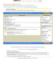
Amazon.com orders

I have to say, Amazon.com has one of the worst order forms in terms of design and usability. I have to look at every piece of the screen to make sure it's what I want, how much I want to pay, and where it's being shipped. Also, they have links scattered throughout the page, some of them doubled. Hmm, sounds like weekend redesign project :)


1 Comments:
runescape money
runescape gold
runescape money
runescape gold
wow power leveling
wow powerleveling
Warcraft Power Leveling
Warcraft PowerLeveling
buy runescape gold
buy runescape money
runescape items
runescape gold
runescape money
runescape accounts
runescape gp
dofus kamas
buy dofus kamas
Guild Wars Gold
buy Guild Wars Gold
lotro gold
buy lotro gold
lotro gold
buy lotro gold
lotro gold
buy lotro gold
runescape money
runescape power leveling
runescape money
runescape gold
dofus kamas
cheap runescape money
cheap runescape gold
Hellgate Palladium
Hellgate London Palladium
Hellgate money
Tabula Rasa gold
tabula rasa money
lotro gold
buy lotro gold
Tabula Rasa Credit
Tabula Rasa Credits
Hellgate gold
Hellgate London gold
dofus kamas
buy dofus kamas
wow power leveling
wow powerleveling
Warcraft PowerLeveling
Warcraft Power Leveling
World of Warcraft PowerLeveling
World of Warcraft Power Leveling
runescape power leveling
runescape powerleveling
eve isk
eve online isk
eve isk
eve online isk
血管瘤
肝血管瘤
音乐剧
北京富码电视
富码电视
富码电视台
7天酒店
7天连锁酒店
7天连锁
自清洗过滤器
过滤器
压力开关
压力传感器
流量开关
流量计
液位计
液位开关
温湿度记录仪
风速仪
可燃气体检测仪
By Anonymous, at 11:29 PM
Post a Comment
<< Home