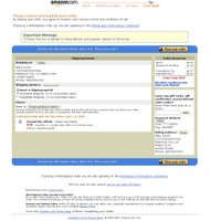
Amazon.com orders

I have to say, Amazon.com has one of the worst order forms in terms of design and usability. I have to look at every piece of the screen to make sure it's what I want, how much I want to pay, and where it's being shipped. Also, they have links scattered throughout the page, some of them doubled. Hmm, sounds like weekend redesign project :)


